Technology, Digg Redesign | featured news

The “Bury” Button Returns to Digg

Another much-requested feature has returned to Digg, as the social news site looks to recover from the version 4 fiasco: the bury button. The button — which is essentially the opposite of the “Digg” button and helps push a story out of the system — appears to be live on all stories.


New Version of Digg Goes Live For Everyone This Morning

New Version of Digg Goes Live For Everyone This Morning

It's finally here. Digg, the social link sharing site that has watched its once-meteoric rise to popularity level off over the last couple years, is relaunching today as it attempts to surge to greater heights — with an added focus on making the site better for publishers as well as users.

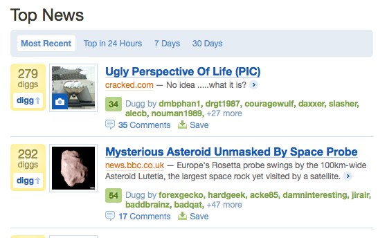
Senh: My first immediate impression is that it's actually better. The design is simpler and more streamlined. Although I'm not sure if it should default to the My News tab for logged-in users. You should always make what made you popular the most important and prominent feature. In this case, it's the Top News tab, which is the top news items based on Digg users. I'm looking forward to auto-submission of news items via RSS feeds.


7 Reasons Why The New Digg Version 4 May Lead To The Company’s Demise

7 Reasons Why The New Digg Version 4 May Lead To The Company’s Demise

Within the past three weeks, Digg.com has allowed some of their most loyal users to sign up and try out Digg version 4 . It has been speculated that they will be doing a full roll out of the new site sometime within the next two months.

Senh: No RSS feeds? Really? That's going backwards, not forward. As for punishing power users, whenever you have a system where users vote on the content, there's bound to be abuse. I'm not sure if there's much you could do about it other than to ban the user whenever he/she is caught.

 

Subscribe to this RSS topic: Syndicate content